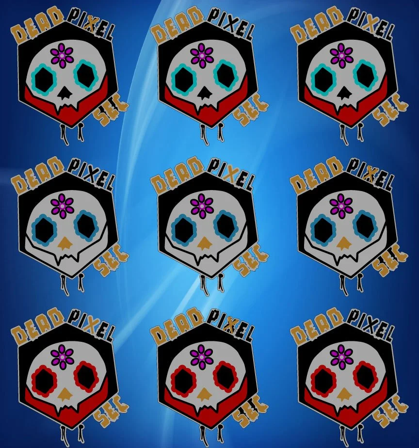
Recently we were asked to update a logo for one of our regular clients side projects.
They had a logo design they used last year for a convention and wanted to update it differently.
With the help of my interns we came up with several different versions for them to choose from.
I like how the top version has one that includes the baseball bat in the text, and the middle layout made good use of the hexagonal design the client mentioned they wanted to be included.
After talking with the client about their revisions, they clarified that they want to use their original design, but to have the baseball and day of the dead elements. This second design incorporates all of those.
The client finally noted that the baseball and day of the dead are two seperate things. The last layout shows the final revision for the baseball, but with the day of the dead they wanted to see another version in purple. Then finally settled on the green and yellow version on the bottom.
It's always good to talk to the client, after the second version we spoke on the phone - as some things we're getting lost on the email communications. There's nothing wrong with picking up the phone to clarify things. Right after that, we quickly wrapped up the design.
Communication is key when working with your client. I’ve found working with clients over the years, that some clients are better explaining themselves in person or over the phone, some need to draw things out. Everybody is different. Get to know and understand your client and their wants and needs. It will make for a better design and easier design process for the client and yourself.
Stay Awesome, and Keep Creating!


